Bergen Light Rail
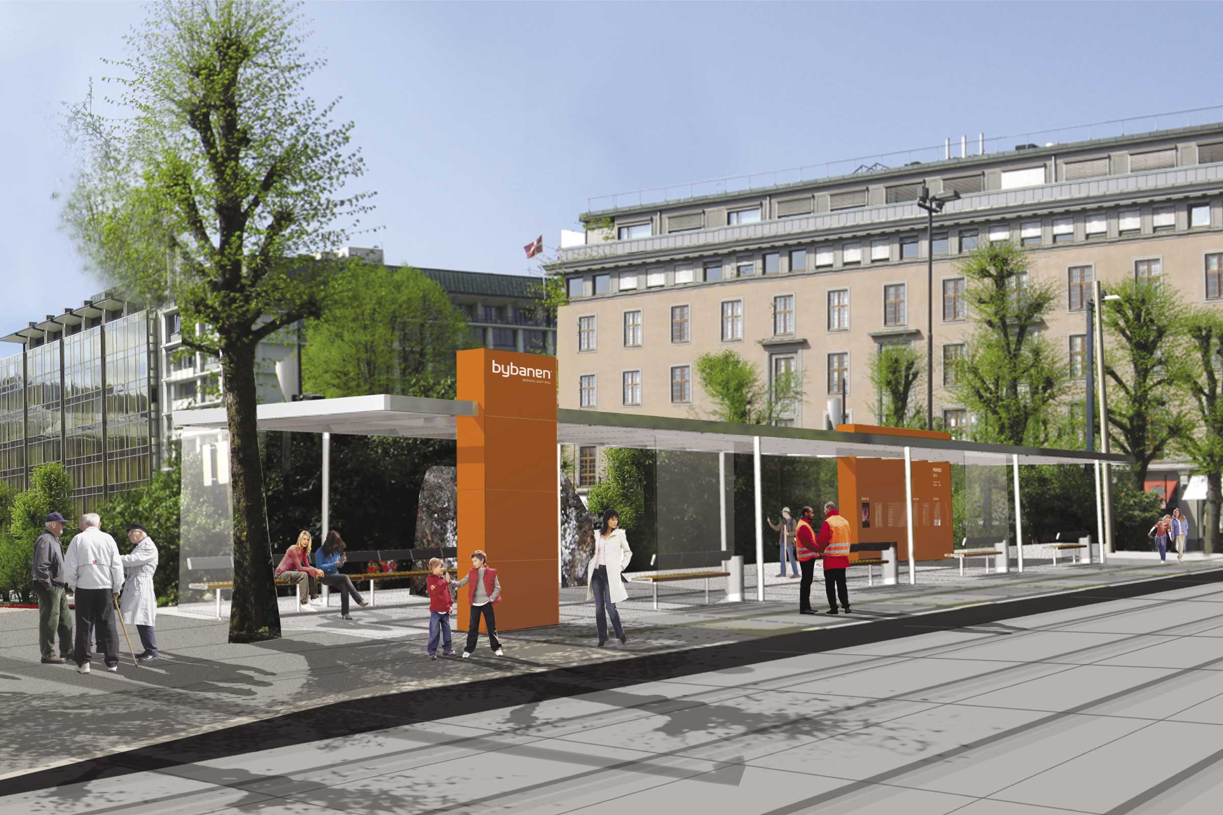
Hop on Bergen Light Rail – Europe’s coolest tram experience! Its brand identity sports an eye-catching orange – convenient for a city with only a few bright months and 239 rainy days a year.

When working at Kontrapunkt, Tor Slotmann of Unity was responsible for implementing and developing the brand identity program for Bergen Light Rail. The project was a collaboration between Kontrapunkt and Norwegian design and architect agencies.
In collaboration with
Morten Sørensen, designer.
Kontrapunkt


DOGA – Design og arkitektur Norge.
One of the light rail’s most significant aspects is coherent branding. The wave pattern and the orange color play the lead role in all elements: brand identity, uniforms, trams, and stations. The user instantly recognizes the Bergen Light Rail.